The Dark Planet
Tuesday, 19 November 2013 - Reviewed by
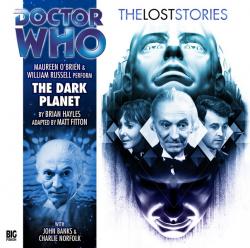
4.01. The Dark Planet
Produced by Big Finish
Written by Brian Hayles
Adapted by Matt Fitton
Directed by Ken Bentley
Released: September 2013
Listening to this one, it's abundantly clear the reason it was cut was due to the budget. There are no extras to confirm it, but this is such a visual extravaganza that I cannot help to think that producing it would be near impossible on anything but a monumental budget. The interplay between light and darkness, the immense crystal city, and the numerous special effects (flight being the biggest one) could not be reasonably portrayed on a 1960's BBC teatime-slot TV budget. Plain and simple.
The strength of this story lies in what is known as mise-en-scene. It's a French concept important for film or televised reviews, but it refers in a general sense to everything that is put in front of a camera. It refers to the acting, the set design, the costume design, the framing, and the lighting. Now, this may seem a little counter-intuitive as this is an audio medium and an audience will not not see these portrayed physically in front of them as one would in a typical film or television show. However, I would refer you to my review of The Creed of the Kromon (found here), where I talk about the cinematography present in the imagination of the audience and aver that audio is indeed a visual medium. Thus, I would argue, talking about aspects of visual framing is equally valid in a well-portrayed audio play as in a film. Though, I will admit, there are some variables in this framing based on the individual audience member's own imagination, a properly produced story can control those variables through effective sound design and writing.
The mise-en-scene of The Dark Planet is found, unsurprisingly, in the use of light and shadow. It is a story of two races of a planet, one of light and one of dark respectively, engaged in an epic struggle so its use of light and shadow is unsurprising. The caverns below are properly dark, damp, and evoke a feeling of claustraphobia with its seemingly contradictory immense physical spaciousness and the all-enveloping darkness. This is reflected in the descriptions and the deep, dark sounds that seem to echo in every direction. This creates an effective feeling of fear by contrasting that very large, forboding physical darkness with the smaller Barbara. Barbara is framed in the centre of your mental image throughout her interactions down below due to the fact that large chunks of that story are distinctly from her perspective. Since I feel many people imagine these 60's era Lost Stories in black and white (I certainly do), as Barbara often dresses in lighter clothing, the contrast between Barbara and the darkness is highlighted further. The mise-en-scene of Barbara, in her light clothing and in the centre of the frame, confronting the darkness is one of great contrast The tableaux of her standing against a seemingly neverending, physical and potentially malevolent darkness is a powerful one.
Meanwhile, the city of light is similarly realised. The mise-en-scene of certain moments needs to be pointed out here as well. For example, the numerous descriptions of the environments as being so white as to be confusing and the beautiful crystal as being so transparent as to not be able to truly figure out the paths it takes, creates a set that is rife with confusion, but also beauty. The moments where The Doctor and his friends fly, in particular, create a beautiful landscape of the confusing, jagged, but orderly crystals in the background and our heroes in centre frame. They're entering a world they don't truly understand, but it's a world that operates under certain rules and its one they aim to be heroes in. The set-design creates a sense of this contrast of chaos and order and, likewise, the framing of putting our heroes front-and-centre in our mind as they rise both visually realises their attempted rise to hero-dom and puts the un-relatable city in the background at odds with the heroes in the foreground.
Now, as I said, realising any of these moments would be near impossible on the budget of the time. However, this is not entirely true. One could obtain the same results with a skilled director and cinematographer. Though I know many Whovians will hate me for saying it, no such directors or cinematographers existed during this time and, I would argue, none exist to the present day. Directors that talented would have to realise the story with existing light fixtures. With brilliant cinematography and a creative use of blocking and zooming to allow for different lighting to show on different scales (for example, showing darkness in a close-up, rather than a full-shot, to create an illusion of darkness all around). This sort of directing is the sort that masters such as Teshigahara or Ozu were known for. Put simply, and it is unfortunate, these sorts of directors only typically direct film – not television. The 60's directors were incredibly skilled and, indeed, many of the shots (particularly of the first episode of the series) were brilliantly done, especially considering how much of the show was done as-live. In fact, to be honest, I think some of the directing of the 60's is the strongest in the show's history. But none of it was up to the task of realising this story properly.
This may be a bit misleading, however. It is a master-class in formalist/expressionist Doctor Who, but it isn't really anything to write home about in terms of plot. The main issue it has is that it is entirely too predictable. From the beginning, we as an audience know almost exactly what is going to happen. Once The Doctor declares that maybe the Darkness isn't all that bad, we know that it will be a plot of trying to get The Darkness and The Light to communicate with each other. The issue is, this obvious path for the plot to go down is made obvious in Part Two. There are four parts left. We, as humans, love to guess at the next path the plot will take. What will happen next. In this serial, the path is entirely clear. The team will get split up and, one representing Darkness and one representing Light, they will come together and either form peace or create tragedy. The only real area where the audience is left guessing is which ending it will take. So, episodes three through five end up suffering as a result. They're gorgeous and, indeed, the story should be listened to if only for the visuals, but they're not engaging in the slightest. The story picks up at episode six, however, and ends on an interesting, visually beautiful note.
There's also a number of good character moments, ranging from Vicki's friendship with the light child, The Doctor's antagonism with the Light King (though he calls himself by another title, he's clearly the King), and Barbara's heroism in dealing with the Darkness. Still, to call this a character piece would be misrepresenting it. It's a formalist piece. It means to impress you with visuals and create a universe that you want to look at and feel things from. Almost all of the feelings created in this serial are visual – and there's nothing wrong with that (in fact, it's the essence of formalism). As I am a huge fan of formalism, I found it engaging and enjoyable (if not particularly life-changing as-in Masadon). If you are more a fan of classicism or realism, I would very strongly suggest avoiding this serial.
(You can check out more of Lani's Big Finish and Doctor Who reviews at http://who-reviews.com/dwnews)


 Contact Us